
Branding is a strategy rather than a formula; yet there are several techniques that companies can use to increase the awareness of their products, services or simply their names. The same applies for their websites.
Regardless of whether a brand is built though online or offline channels, the key is to make all the elements work together to evoke a specific feeling. An excellent point about this is made in Tim Halloran’s Romancing the Brand: How Brands Create Strong, Intimate Relationships with Consumers, which describes the process of creating a brand – from testing to generating supporting materials in the form of story, logo, slogan, and the like.
More importantly, however, Halloran describes how one of the leading brands, Coca-Cola, made its shift to digital strategies, where the key rules of successful branding still matter (though in a somewhat different form). Unlike in the physical world where consumers can become familiar with the quality of a product directly, in the online environment much of the corporate identity depends on users’ experiences with the company’s website.
SEE ALSO: How to Effectively Use Color When Branding
Online branding and the role of a website
A summary of correlations between user experience and overall brand perception is neatly presented on this infographic, which outlines the factors that influence people’s satisfaction with a company website. Obviously, when creating the infographic, Crucial heavily focused on design, and justifiably so. Being the place where most conversions actually take place, a website is certainly one of the major brand elements that reflects the general idea behind a company.
Besides ensuring that a website performs smoothly in all critical aspects, a company must also pay attention to the visual impact. Strategic placement of brand elements across a page can significantly boost conversions, which in practice translates into the techniques described below.
Visualizing the brand: color and placement of brand elements
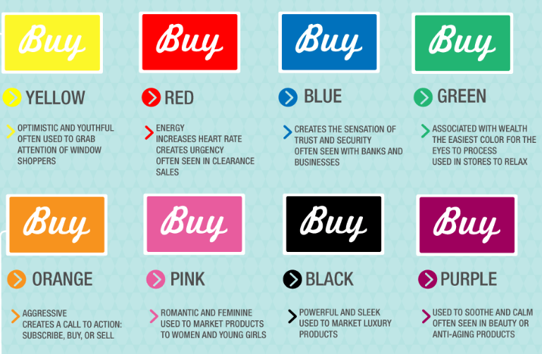
In terms of visual brand elements, color is probably the factor that contributes most to evoking a specific feeling. In fact, research shows that color accounts for 90% of snap judgments, which makes it a critical element of both branding and design. In terms of website experience, the predominant color or color of a product can have an astonishing influence on people’s purchase behavior. Siteforbiz dives deeper in the psychology of colors and gives a list of feelings website colors can trigger in a user.
Similarly, the color of all the major brand elements, such as logo, can significantly determine a consumer’s attitude towards a company; however, this is not the only thing that matters in web design. In addition to choosing a color that perfectly illustrates a company’s story, logo placement is yet another thing that can trigger higher conversions.
Namely, heat maps and different eye-tracking studies have long identified how a person’s attention shifts across the screen. Since most people’s attention is focused on either a top-left corner or the centre of the screen, these are the key two places to position the most important page elements. With a logo in the top-left and linked to the homepage, consumers can easily navigate through pages. As for the central place, this should be reserved for a conspicuous call-to-action button that attracts clicks and counts conversions.
SEE ALSO: Shutterstock Reveals Color Trends of 2014
Evoking a sense of trust and security
In a world where cybercrime has become a common notion, it is crucial for an e-commerce website to establish itself as a reliable brand. To emphasize its dedication to providing security, companies can go at length with blog articles, white papers and other textual elements. However, the actual conversions may come only when this is reflected through corresponding visual elements.
Namely, as shown in the study by Actualinsights.com, security certificates obtained from companies that have already established their names in the field can be critical for increasing conversions. Placing logos/badges of the major security and privacy service providers, such as TRUSTe, McAfee or VeriSign, can increase people’s sense of trust and security and, subsequently, conversions. Namely, the survey shows that almost 76% of persons feel these trust logos increase their sense of trust, while 61% of people are likely to leave a website if they feel something is missing.
Furthermore, another way to make visitors feel comfortable with taking actions on a website is to include logos of accepted payment systems on product pages. Brands such as Visa, MasterCard or PayPal, that have a long history of secure and fast transactions, not only give the information about possible payment methods, but also make people feel safe about working with familiar brands. The impact on conversions, therefore, can be striking, which is confirmed in a 2000 study by ClickandBuy, which revealed that 40% of consumers are likely to abandon a website or a shopping cart due to the lack of payment symbols utilized.
Conclusions
Much like branding through off-screen channels, creating a stable image online requires a set of strategies, some of which revolve around designing a company’s website. This is a place where all the ideas and images that constitute a brand should be displayed in order to tell a story – a story that is memorable and, more importantly, a story that converts.
Images: Siteforbiz