


More insights


Featured
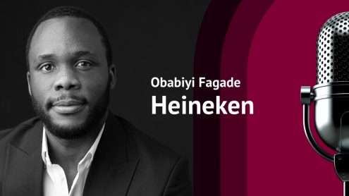
Heineken's commercial development manager of global brands offers insights on the power of local cultures to diversify and grow global brands, and more.
Podcast: Branding over Wine
See moreWe're doing a bit of soul-searching to better know our readers and improve your experience. Please take this 2-min survey and you might just WIN the first edition of our new eBook series: State of the Brand!
Use the Bm | Bn switcher in the top-left corner to seamlessly switch between our Brandingmag and Branding.News websites.
Got itWe noticed you're using an ad blocker. Totally understandable, but our ads are minimal, always relevant, and a great help for supporting our ongoing efforts to narrate a quality discussion around branding.
Please consider disabling your ad blocker or sign up/sign in before diving into our exclusive insights: